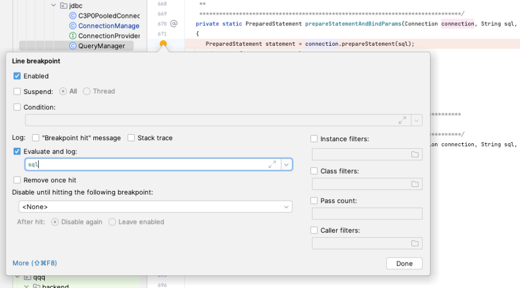
Today I (re)discovered a potentially-quite-useful option in the IntelliJ debugger:
If you go into “More” when right-clicking on a breakpoint, then turn on “Evaluate and log” and enter an expression, it’s basically the equivalent of adding debugging print statements, but without actually dirtying up your code with them. When coupled with un-checking “Suspend” (e.g., making the breakpoint not pause the program’s execution), it’s kinda perfect.
I feel like i should be using this a lot more often!
Makes me wonder what the rest of this screen does. I have used “Disable until hitting the following breakpoint” before, to help avoid the dance of: set a breakpoint; run; break; resume; resume; resume; “is this the context i wanted? no? resume”; resume; resume; “oh crap, i missed the one i wanted! restart!!!“; resume; etc
Well, after 25 year of being a programmer, and around a decade of being an ever more all-in Apple fanboy, I’ve finally allowed those worlds to merge a bit, and I’ve published my first app on the iOS App Store!
Oh, I’ve had many half-baked ideas for apps over the years, but one issue had always been, that I’d never quite learned the specifics of how to do iOS development. I also played a role in a few apps that my teams built over the years, for MMLT and Infoplus, but none of those were ever truly *mine* from start to finish.
(humble brag? I did get through both of those tutorials in well under 100 days… I think that 100 number is meant for if you’re just starting out as a programmer – not a distinguished engineer as myself :lol:)
That eliminated my excuse of not quite knowing *how* to build an iOS App. It left me with just not having an actual app to build, plus the inertia of being “at rest”, meaning I’d never actually built an app from “0 to 1” as they say, and gone through the process to publish it to the App Store.
But over the past few months, I finally had a use case come up that would actually be useful to me, at least on a daily basis, that I think could potentially be slightly useful to others, and that was of a scope that I knew I could tackle at this point in my life.
I’ll avoid the gritty details of “why” this need exists, but suffice it to say that, virtually every day I am asked to perform a time-based calculation, which generally takes the form of:
Point-A to Point-B = Interval-C
Interval-D minus Interval-C = Interval-E
Point-C plus Interval-E = Point-D (which is our desired answer)
For example:
11:47 to 12:26 = 39 minutes
4 hours minus 39 minutes = 3 hours 21 minutes
1:18 plus 3 hours 21 minutes = 4:39. QED.
It’s not fun to do that math in your head (heck, for me, it’s barely possible!). It’s a little easier to do on paper, but then, who has that much paper just lying around? I’d like to do it on my Mac or iPhone, but what app do you use for that? Doing it in a regular calculator app is just about the same as doing it in your head, thanks to all the number-bases and intermediary values. So I searched the App Store for Time Calculator apps, and let’s just say that none of the results were satisfactory for me.
Therefore, as a programmer, I wanted to solve the problem by writing some code. And having recently completed the Swift tutorials mentioned above, I was ready to build my own app. The pieces were starting to line up for something good!
So I wrote some code! It was lots of fun, and I think I took an okay approach, both in terms of the structure of my Swift and SwiftUI code – several discrete views, a completely isolated model – unit tests on the models, and a heavy dose of Swift enums, that I used to implement a finite state machine, to manage the parsing of user-keyed time equations, as well as the enabling and disabling of all buttons on the calculator screen.
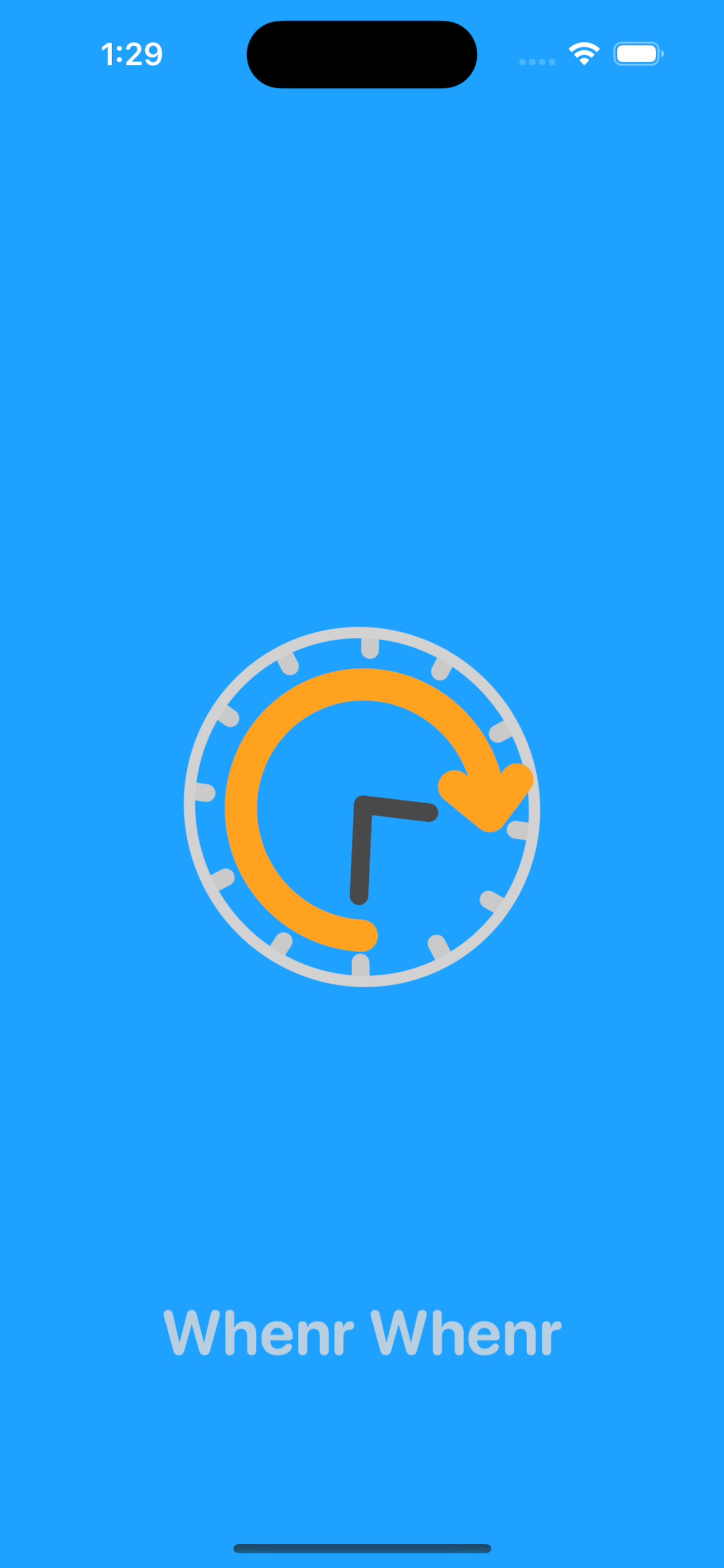
Wait, at this point, I should probably show what the app looks like. So, here are some screenshots!
That’s a fancy Time Calculator!Copy, Share, and Create RemindersDark mode support!Fancy animated Splash ScreenOnboarding / Tutorial screensSettings to force Light or Dark mode.
The last problem to overcome was one of the two Hard Problems™ in Computer Science: choosing a name (the other hard problems in CS being cache invalidation and off-by-1 errors). I won’t say I’m “proud” of what I ended up with, but I can at least say that it’s fun, and, by golly, I like fun things.
So my first App published on the App Store is officially named: Whenr Whenr
(to be me, and explain the thing that’s probably obvious… that name is based on the word “when”, but with an awkward ‘r’ appended onto the end, to ape a certain style. then it’s supposed to sound like “winner winner”, which reminds me of the fun expression “winner winner, chicken dinner“. ok, explanation time over, back to the blog)
There you have it. A rough tale about my first iOS App. Of course I’ve got a long backlog of things I might add to it some day:
Support for seconds and/or decimals
Support for Dates and Date/Times
Date and/or Time pickers (the standard iOS widgets for choosing, rather than keying the values)
Saving the Ledger; having multiple Ledgers; exporting the Ledger, naming and time stamping entries in the Ledger – lots of Ledger work.
Widgets… yeah, it should have widgets. And shortcut support – not sure how, but somehow. Oh, and to keep up with the times, Live Activity / Dynamic Island support! Heck, if it was just spinning the icon, that’d probably be sufficient!
Starting a timer (e.g., from the Clock app) from an Interval in the app.
But – I decided to finally “shoot the engineer and ship the app” today. Which meant I got to spend a whole lot of time making lots of images for App Store Connect… Not too much fun, but a nice change of pace I guess.
Oh, I should probably provide a link to Whenr Whenr on the App Store. It’s available for iOS, iPadOS, and macOS (for Macs running Apple Silicon, as it’s just the iPad version).
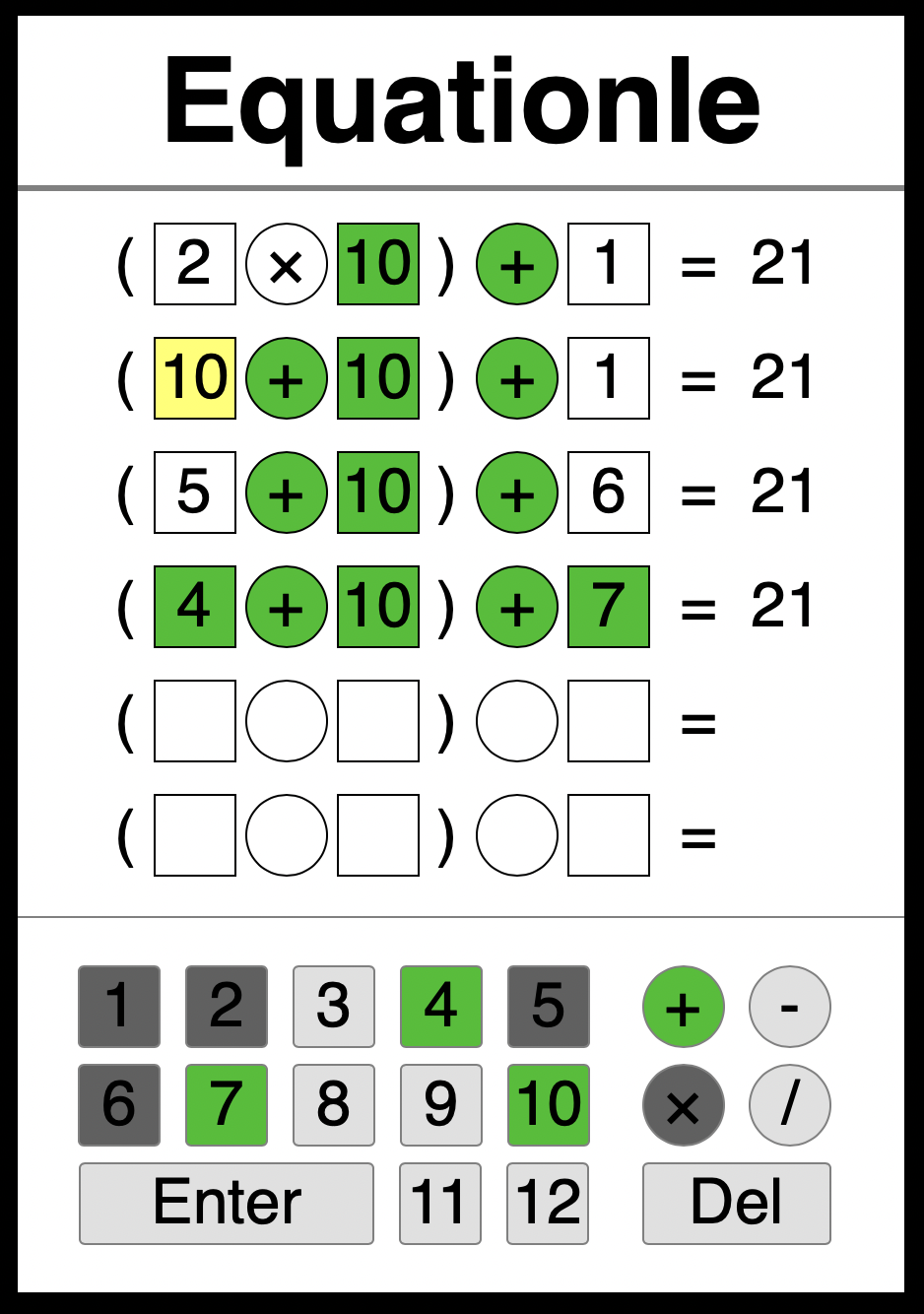
Earlier this year, when the game Wordle was all the craze, I woke up one morning with the idea in my head of the same basic game, but instead of choosing letters to make a word, the objective would be to pick numbers and operations (addition, subtraction, multiplication, division) to complete an equation.
The result is online at http://equationle.com. It’s nothing polished or complicated or great in any way, but, I had fun building it, and I get a little bit of fun from playing it.
I decided to make the equation* consist of 3 numbers and 2 operators that the player must figure out, which would be shown to equal a pre-determined number. To make things a little more constrained, I thought to put parentheses around the first 2 numbers, so you wouldn’t have to worry about order of operations (e.g., doing multiplication before addition) – the parentheses would mean to always do the left operation before the right one.
For example (as shown in the screenshot):
(number operator number) operator number = 21
Just like in Wordle, a correct guess is shown in green, and a guess that’s in the equation, just not the right place, is yellow. Incorrect guesses are shown on the on-screen keyboard in dark-gray. You can enter an equation which doesn’t equal the number shown – if so, that line will switch from showing an = to a ≠ sign. Oh, and unlike Wordle, every time you reload the page you get a new game (and I didn’t build the result-sharing feature…).
Before I put together the user interface for the game, I first wrote a little program to generate all possible equations fitting that structure, and to work out their result. Then, so that the game would never pick an equation that only had 1 or 2 possible combination of inputs to produce the answer, I counted (well, my program counted) how many equations each produced every given answer, and then only kept ones that had more than 10 equations.
Finally I placed that list of equations into a JSON data structure that I loaded into the HTML/JavaScript user interface that I put together, and I did my best to copy the CSS styles used on the real Wordle. After buying a domain at hover.com and uploading to Linode, I was all set.
* Technically, I suppose, since we’re only building the “left hand side” of an equation, I should call it an “expression”, but, this isn’t a formal paper or anything, so let’s just go with this loose language.
Coinciding with the great explosion in work-at-home that came about with COVID-19, there was a big increase in popularity of the Elgato StreamDeck. I assume someone other than I can explain this connection better than I can. I think it has something to do with being on lots of video calls, and for some reason, the StreamDeck is apparently helpful for folks doing live video streams, like you’re basically doing on a zoom call.
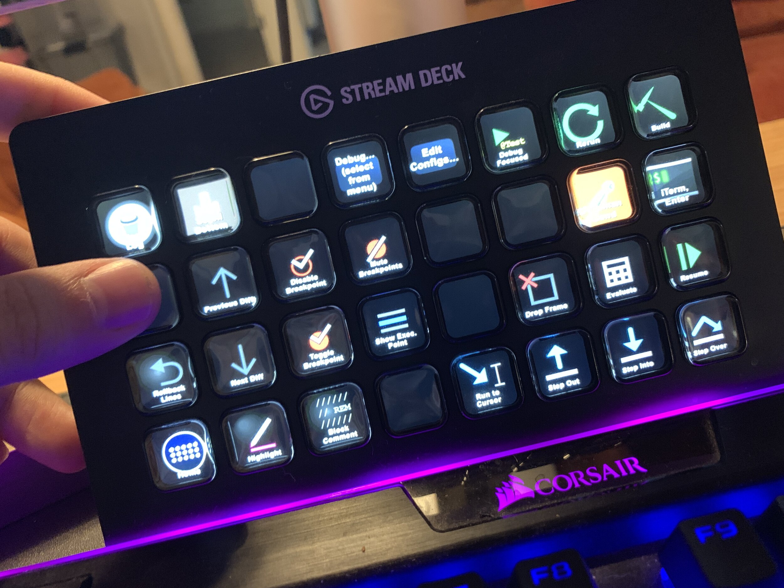
My StreamDeck – Positioned just between my keyboard and monitor
But for me, the potential of the StreamDeck was all about extending the customization of my Mac, not just for streaming, but for everything I do day-to-day on my Mac. I’ve always been a big believer in using the keyboard as much as possible instead of the mouse, and one of my favorite things about macOS is how you can define global keyboard shortcuts, and add tools like Keyboard Maestro to give you access to more commands without using your mouse (or trackpad in my case).
But, one challenge with the standard keyboard shortcut approach is the mental load of remembering all of the various key combinations (sometimes called “chords”) that you have to “play” for each different app, and all of your commands, some of which may be a bit obscure as well.
At one point, for one my most common tasks as a software engineer, debugging, I printed out a rather janky little paper guide that I physically taped to my keyboard above some of the function keys, to help me remember which key did which command, with what set of meta keys… I guess in a way this was my proto-StreamDeck, as the idea was in part the same: giving a visual cue to avoid having to completely remember every key combination.
Enter the StreamDeck
But the StreamDeck goes to the next level. (Let’s be honest: it’s pretty easy to go to a level beyond a piece of paper taped to your keyboard…)
For one, you can customize every button on it – both in what it does, and in how it looks. That’s because every button is a tiny LCD screen. On my StreamDeck XL, that’s 32 buttons, in 4 rows of 8. Now finding or creating good icons can be a challenge. Elgato has a selection of icons, but honestly, I think they’re terrible. I’ve invested some time on my more popular profiles creating good icons – but I also get lazy and, well, you’ll see some of that if you look at my screenshots.
Next, you can add a whole new dimension to the StreamDeck, by setting up a unique set of keys to be available based on what your active application is. So that’s 32 buttons for IntelliJ, and 32 other buttons for OmniFocus, and 32 for Obsidian – I think you get the idea. This feature allows you to really add “contextual” power to the StreamDeck – where the buttons that make sense for the context that you’re in appear – and they’re out of the way the rest of the time.
In terms of what you can do with each button, there are dozens of built-in actions, such as activating an application, or simulating a key sequence, or changing system attributes like the volume. There’s also a healthy marketplace of plugins, and the killer one for me is KM Link, which gives the StreamDeck 1st class access to run any Keyboard Maestro macro on your system. (Note, there’s also a plugin that’s just called “Keyboard Maestro”, which isn’t nearly as good. If you’re reading this, and trying to do this setup, go with KM Link!) By combining this excellent piece of hardware, with one of my favorite pieces of software, we really get into a near Apple-like level of greatness.
My Debugging Profile
For the rest of this post, I’m just going to lean into the jargon of using a debugger, and assume that you either know what these actions mean, or, you don’t care. That is to say, I’m not going to explain the details, but rather, just paint a picture. So, to start, here’s the picture:
To get started, the buttons I probably use the very most of all are in the lower-right – the debugger step/flow-control commands. Starting from the bottom-right, i’ve got Step Over (the one I use the most), and right above it, Resume. Then to the left, the less-common Step Into, Step Out, and Run to Cursor. There’s also a control-flow power move: Drop Frame.
Next I’ve got a set of keys for controlling breakpoints: One to toggle the “Mute” state for all breakpoints in a debug session. Then two to Toggle a breakpoint on or off for the currently focused line, or toggle the Disabled state of the breakpoint on the current line. To help with these last two, I often need to make the current broken-line be focused, so there’s a button to Show Execution Point as well.
I’ve got a set of buttons on the top-right for building and running code as well. There’s a hot key in IntelliJ to run or debug the unit test (or test class) that your cursor is currently inside of. This works for either a test class or method. I call it “Debug Focused“, as I actually launch my tests in debug mode (instead of run mode). It’s actually the same as clicking the little “run” icon next to a test class or method, in the gutter of the editor window, but so much easier to run by just hitting that button on my StreamDeck. Similarly, there are times when I find myself frequently editing Run Configurations and then launching one of them – so the (text-only, no-icon) buttons “Edit Configs…” and “Debug… (select from menu)” make those a single-tap to get into. Finally in this set, there’s “Build” (self-explanatory), along with “Rerun” – which is dangerous if you’ve got a server with a slow startup time, but which is great when working with small services that you like to frequently restart in case a hot-swap fails.
Similar to those buttons for running, I’ve got a couple of odd-balls: The first is for a case where I want to go to Postman and click the “Send” button, to issue an http request to my code that’s running in IntelliJ. Rather than do that by-hand, I’ve got a KM macro to do it, and this dedicated StreamDeck button to launch that macro. Similarly, I’ll often have a shell script in a loop, paused waiting for me to press Enter, and when I do so, it then issues a curl request to my running server – so that “iTerm, Enter” button automates switching to iTerm, hitting Enter, then switching back to IntelliJ for me.
In the miscellaneous section toward the left, I’ve got a few really useful buttons for cycling through diffs in the currently open file – “Previous Diff” and “Next Diff“. In addition to just letting me quickly review what changes I’ve got in a file, I combine these with “Rollback Lines“, to quickly revert changes that I don’t want.
There’s also a “Highlight” button, which I don’t use much, but it surfaces the IntelliJ command to highlight the word under your cursor, and all other instances of that word, with a bright color, to make them easier to see together. Finally here I’ve got “Block Comment“, which runs a plugin I built to create a big flower-box style comment block.
The last 2 buttons in this section also do KM macros, to find images on the IntelliJ window, and click them – one, to Clear the Log of my currently running application, and the other, to just Scroll the log to the Bottom – both actions I used to do a handful of times every day with mouse – now just a tap anytime I want them. And yes, I didn’t even try on these icons, and just got them from the web 🙂
I don’t know if 1,000 words about debugging with a StreamDeck can convey how much I feel like it’s boosted my efficiency. I’m quite convinced that it has, however. If nothing else, I find myself much more eager to do use some of the techniques that I have dedicated buttons for now. And I know that I get a smile on my face as I do them. I’m never frustrated by hitting a wrong hotkey, or struggling to remember if a command needs the Option ⌥ or Control ⌃ button to be held down. There’s a real satisfaction that comes with seeing the icons I’ve created (even the bad ones). And I love having a physical world connection to my debugging experience. If it makes me more efficient as well, then it’s icing on the cake!